My customer wanted a landing page with a slider. It should be full screen. Outside the visible area, the actual content should live. When the user would scroll up, the content would move in sight. At first, it looked like an easy thing to do.
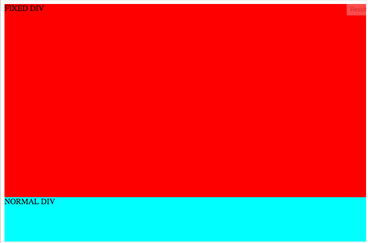
I made two divs, the first one of them fixed. The fixed div should be 100% in height (and width) and cover everything. The second div should be direct below the fixed one.

The example above shows what I mean - the first div having 80% height for illustration purposes.
Turned out, this is not easy to achieve. “position:fixed” takes a div outside the usual flow.
The first recommendation I found was to use “margin-top: 100%”. I tested that, and it was horrible on mobile. At some point, the content div would move up to my slider. I asked the question: 100% of what is margin-top using? And it seems, this was the right question to ask.
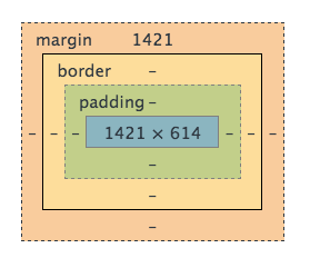
When my browser has the dimension of 600x300px, then margin-top 100% would be 600 pixels. If the dimension is 1200x600px, then margin-top 100% would be 1200px. It makes sense if you understand why. You can read more that here.

I looked at StackOverflow and friends. Many people solved this issue with giving the fixed div an absolute height of let’s say 80px. Then they added padding-top to the second div with 80px as well. Worked for pretty fixed layouts.
In my case, it didn’t help, because I wanted my slideshow to look everywhere the same. I can’t tell what the height of my fixed div is.
Luckily I found it can be solved pretty by adding another div as a wrapper.
Imagine the following HTML code:
<div class="landing-wrapper">
    <div class="landing">
        Could be an image
    </div>
</div>
<div class="article">
    Article
</div>
Where .landing is the fixed div:
.landing {
    height: 100%;
    width: 100%;
    position: fixed;
}
And .article is the content shown outside the fold. Then you need to make the fixed part of the “flow” again by wrapping it with a div that is part of exactly that:
.landing-wrapper {
    height: 100%;
}
The wrapper takes the initial space and puts the article div down. The wrapper disappears with scrolling; the fixed div stays.
I found this a readable and elegant solution. It works at least on recent versions of Safari, Firefox (yeah, even there) and of course Chrome. I also checked some mobile browsers for iOS and Android and it worked too.
You can fiddle around with this at JSFiddle.